Friday 21 October 2011

Production Plan

Production Plan
Anima

We need to gather all of our props which include props:
Parachute men - £1 each, we purchased two packets in total of £2 for 16 parachute men.
Bouncy Balls - £1.60 for 15 balls on eBay, for 50 balls we will pay around about the £6 mark.
Giant Confetti Cannon - £2 each eBay, purchase 2 possibly for £4.
Glitter - Hobby Craft £1/2 each packet, about three to four different colours.
Confetti - 50p from Petals Loft in Bexleyheath, already purchased.

This is the over view of the costumes, what we are using and how much:
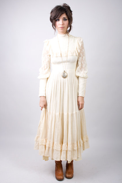
For the more subtle and soft part of the song we will be using a very hippy but natural looking outfit.
We will get this outfit from either Charlotte's collection or Libby's or last resort we go into a charity shop and buy one for £5 or under.
For the more louder and vibrant parts we want her to wear something very bright and fun preferably a dress from Molly's collection which is very 60's Bohemian.

We will be using different locations so that it sets the scene for the music:
The first location will be in the Gallery in the Art department for our first shot with the parachute men. This will not cost anything.
We will also be using Bostal Heath for our intertextual reference this also will be free to use.
When she is singing with a microphone we will put her in the gallery with a  green screen behind her, we were thinking of putting either some sort of tie die on the green screen or a massive image of the inside of an apartment.
We will also be using Danson Park on firework night so that we can film the fireworks to put into our music video

Do we need any permission for the locations we have chosen?
The only permission that we need so far are the scenes in the gallery as we need to make sure that their is no exhibitions being held in their at the time of filming or that no one is working in their and need it to themselves.

Who are we using in our music video?
We are going to use Molly Baxter in our music video as the main singer. We have asked her and she has agreed to film with us which has relieved us of that part of our planning.

Who will be on the set on the filming of our music video?
The people on the set whilst filming will be Libby, Charlotte, Si Hin and for only certain parts of the music video Molly Baxter will be present.

What do we want the end product to look like?
We want the end production to be a very Bohemian type video, that is a lot of fun to watch, dance to and listen to. This is going to be visually dynamic and pleasing to the eye.


Wednesday 12 October 2011

Genre (Bohemian)

Genre of our Music Video

Bohemian:
Bohemianism is the practice of an unconventional lifestyle, often in the company of like-minded people, with few permanent ties, involving musical, artistic or literary pursuits. In this context, Bohemians can be wanderers, adventurers, or vagabonds.


A native or inhabitant of Bohemia

A person who has informal and unconventional social habits, esp. an artist or writer
  • - the young bohemians with their art galleries and sushi bars

Of or relating to Bohemia or its people

Having informal and unconventional social habits
  • - the bohemian writer's drafty-garret existence


Its Oh So Quiet - Lyrics

It's oh so quiet
shh shh
It's oh so still
shh shh
You're all alone
shh shh
And so peaceful until...

You fall in love
zing boom
The sky up above
zing boom
Is caving in
wow bam
You've never been so nuts about a guy
You wanna laugh you wanna cry
You cross your heart and hope to die

'Til it's over and then
shh shh
It's nice and quiet
shh shh
But soon again
shh shh
Starts another big riot

You blow a fuse
zing boom
The devil cuts loose
zing boom
So what's the use
wow bam
Of falling in love

It's oh so quiet
It's oh so still
You're all alone
And so peaceful until...

You ring the bell
bim bam
You shout and you yell
hi ho ho
You broke the spell
Gee, this is swell you almost have a fit
This guy is "gorge" and I got hit
There's no mistake this is it

'Til it's over and then
It's nice and quiet
shh shh
But soon again
shh shh
Starts another big riot

You blow a fuse
zing boom
The devil cuts loose
zing boom
What's the use
wow bam
Of falling in love

The sky caves in
The devil cuts loose
You blow blow blow blow your fuse
When you've fallen in love

ssshhhhhh... 

Questionnaire

Questionnaire

When doing this questionnaire we do not have a main focus of younger audiences up to middle age, this is because we feel that these are the people that are more likely to listen to the music we are using; they are our target audience.

Song: Oh, So Quiet

Our Idea: For our music video we want to keep it fun and entertaining with lots of vibrant colours, we are using juxtapositioning as well so that we can combine the lyrics with the narrative. We want to use a calm atmosphere when the song goes quiet for example a shot of some empty stairs or some parachute men falling in slow motion then when it picks up again the shot of the stairs is intruded by lots of bouncy balls falling down and the parachute men get thrown off course harshly. By doing this we are adding colour and fun to the video but making sure we follow the beat of the music. We also want to use time lapse within the video and lots of colour, that is our main focus.

Male / Female (Please Circle)

Are you a student? Yes/No (Please Circle)
If not please state...................................................................................................................................

What age are you?
.................................................

Which genre of music do you most prefer? (Please Circle)
Country
Pop
Rock
Indie
Heavy Metal
Hip Hop
R 'n' B
Folk
Brit pop
Alternative
Bohemian 
If other please specify.............................................................................................................................

Who is your favorite band/singer?
.....................................................................................................................................................................

What is the most recent music video you have watched?
..................................................................................................................................................................

Did you enjoy it if not why?
....................................................................................................................................................................

Are you interested in the idea that we have put across? 
Yes/No (Please Circle)

If so do you think that it sits well with the music we our using?
Yes/No (Please Circle)
If not please Specify................................................................................................................................

Will you look out for this music video?
Yes/No (Please Circle)

If so would you consider downloading it?
Yes/No (Please/Circle)

Audience Profiling Anime

Tuesday 11 October 2011

09/10/11

Journal

So Charlotte and myself were out shopping and we came across some party bag supplements which we found very interesting among them we found some bouncy balls which we want to use for our video any way but we also found some parachute men. Not until later that night Charlotte came up with the idea to use them and have them in slow motion as the music is quiet but as the music speeds up they are blown off course with an invisible fan which won't be shown on camera. This we felt went perfectly with the mood that we were trying to create and added a bit of fun to it at the same time.

Screamin Jay Hawkins

Screamin Jay Hawkins Poster Analysis


This is a poster of a gig for Screamin Jay Hawkins. The image of him is very unique and in a sense reminds me of German Expressionism but the fact that it is rather distorted shows that his music is also very distorted and not the average thing of that time. Also it gives a sense of a horror show as he looks very creepy and his smile is sadistic. The flames behind him could suggest that he is present on the stage and that you can feel his music and he owns what he does with great enthusiasm. The text pacifically '9th FRI, MAR 31' shows that his show is spine tingling but also a sort of horror show as that is the type of text you would see promoting a horror, this gives a sense of excitement tot he listener as they do not understand why music could be scary, until they hear Screamin Jay Hawkins that is.   


AC/DC

AC/DC Digi pack Analysis


Top Left:
The fact that the over all colour of the cover is red it shows that they are a band that are hard hitting and one not to be missed. It also shows a sense of sorrow as red can be seen as representation of blood, knowing this people will automatically assume that this band are very hard core and have a message to send. The fact that the type is very simple shows that they have everything that they want to say in their music and that they do not need any thing fancy, not only this but the type is quite an edgy type which shows that they have a unique edge to them.

Top Right:
This is the front cover of the pack which has an image of the main guitarist Angus Young, as he plays amazing solo's he is shown as the main focus of the band and also it gives the audience a chance to recognize the type of music as we see a sweating man playing a guitar many people would get what sort of music that is straight away. Also the fact that the image of Young has been blurred a few times to that it looks like a type of time lapse it gives the audience a sort of blurred vision and radical style of music. It has everything on it that the audience needs to be informed about such as the album title and the band name in the iconic font.

Bottom Left:
This is the bit that holds in the booklet for the information and possibly lyrics for the song. On the cover of the pocket we can see all the band members lined up against a wall so that we can see them all in an average back ground that is not too showbiz and rather ordinary that we can all relate to. Not only that but it can remind us of a type of execution as they used to line up all the men and shoot them, this could mean that their music is very meaningful but it will hit you like a bullet which is exactly what their music is about.

Bottom Right:
This is the CD itself which has the same cover as the front of Angus Young playing a guitar, once again it is to show confusion and blurred vision but not only that it shows repetition, that they possibly do not need to come up with lots of different designs to intrigue the listener.


Monday 10 October 2011

Lloyd Banks

Lloyd Banks Digi pack Analysis


Top Left:
By using the dollar sign he is showing a sort of power especially by putting his face on the twenty dollar. Not only that but also it shows what he was earning whilst on the street himself. He has also replaced parts of the dollar note with his name and logo, but doing this he can once again show authority and a powerful person. He has however kept the theme of the dollar note with the type and the colour which is familiar to the public. 

Top Middle:
By using the same logo on this side it is showing a consistency about the album, not only that but he uses the same colours, however you do not see the green parts on the side which shows a more simplistic part of the album. With keeping with the theme the type that is used is very western country but also readable. Also by using the stamp behind the text which might be some kind of authoritativeness stamp but in his own version it would seem a stamp of approval.

Top Right:
This is a close up of his face on the one hundred dollar note, this once again shows authority as only figures of power have their faces on money. Not only this but by using something that is familiar to people it poses as something that they can relate to, which also brings up the comparison between the twenty dollar bill and the fact that this shows that this is what he is making now compared to the twenty dollar bill. By using such a large number on the dollar note it also shows that he is a rich character and can afford to make good music that entertains.

Bottom Left:
By using this as his front cover he is envoking a response from a certain type of person, by wearing the baggy clothes and the army wear, he is trying to show a tough exteria which is what people want to see as they do not want to rely on some one that is easily hurt. He also shows a sort of stereotype with were he is in his image, this shows that he is relatable to the more sincere and common person. The text once again carries on in this cover which shows a theme and a continuity.


Bottom Middle:
With the CD cover we can see that once again he has carried on with his theme of money and green, he has even put the dollar sign on the middle of the CD which is centred well and also can relate to the common people. Also the type keeps with the rest of the album.

Bottom Right:
This is simply the CD itself but this one has a big difference to the one next to it as it is a more darker colour that is in a sense more attractive as it has more of a unique graphic like style to it. As i can see it the image is of books stacked up which if so this could show that he has worked hard to bring out this CD and that he wants to show this within his music, he also has the type 'New York' on it which shows his home town and his passion for it.


Monday 3 October 2011

Mood Board

Our Mood Board

This is an image of our mood board, it the whole thing whereas i have put close ups of some of the certain things on the mood board. The whole theme of this mood board is of a calming nature but with an edge.


This is the name of our group 'Anima' this is the latin word for 'Soul'. We decided that we wanted something that was not familiar and that we wanted something that would stand out. We chose to use latin instead of spanish or any other language because Latin is the oldest language and when we saw this word we knew that this is what we wanted to use as it shouts what we want it to shout for our band!

This is a close up of the pictures that we printed of Bjork and the type of thing we want to convey when doing our music video. The vibrant colours but the relaxing nature to which she has in these images. The image of the colourful balls is to show the type of thing that we want to do for when the beat of the song becomes very fast and moving, but we want to use paint bombs instead of balls, this will create a draw back as we need to make sure we can find the right place to do this in.


This is of the type of Juxtaposition we want to accomplish when making the video, the plain picture resembles the part of the song where it goes very quiet we want to reflect that within the micro features which includes costume and make up, then the vibrant section resembles the part of the song when it gets loud and we want once again the micro features to reflect this through costume and make up.


These are the lyrics we have printed off and we hope to annotate them with what we want to do with out music video at certain parts of the song so that it is broke down bit by bit. When this is done we will put an image of it onto our blogs.


This is of the brief and the ideas that we want for the music video all on the mood board clear as day so that there is no confusion.

Most of this information and more is on my post called '30/09/11 Journal'

30/09/11

30/09/11 Journal

Today we made mood boards in the lesson, we all had the song that we wanted to use and the brief that we were using. We were using for the base of the board a colour that would reflect the type of song that we had chosen for example we had chosen Bjork's Oh so Quiet which is a very hippy like song and very jazz like so we chose a subtle orange with a subtle green to go with it. They were not bright colours but very dull which set the mood very well.

We came up with certain things that we could use within our video such as paint bombs to chow the burst of colour when the song becomes very up beat, this sounds like an amazing idea however it can come with some draw backs such as were are we going to do this, but we like the idea so much that we are defiantly going to find some where that we can do this.


We also decided to use time lapse, this would hopefully work really well with the up beat parts within the song. We were thinking of doing some sort of London setting or some one doing something but within a time lapse.


We were also considering doing something with inanimate objects and suggesting that they can talk as you see in the confectionary advert, however we would have to use an object that meant something to the song, not just a random sweet. We thought that this would add a sense of fun and weirdness to the video as it is a very unusual song.


One word that kept popping up was 'Juxtaposition'. This was being used in the context that when the song would go quiet we would use basic and subtle colours for the person that was the main focus and then when the music became fast and upbeat again we would use vibrant colours with the make up and the clothes that they were wearing. This would be used as a sort of micro feature, and it will add to the experience of the video hopefully.